1. I used to live in Saint Petersburg for a year. It is a wonderful place with beautiful architecture and lots of touristic attractions, such as Winter Palace also known as Hermitage, Nevsky Avenue, with its massive buildings and theatres, Curch of the Savior on Blood, etc. Saint Petersburg is called the cultural capital of Russia. However, in my presentation I decided to look at the other side of this city, with its own wonders and mysteries.
Every time I left home for a walk, shopping, work, etc., I found myself observing so many different situations, abd which either repeated themself or seemed so contrasting to each other or just were being funny to watch at and compare to. I tried to document these things and create a story for them. So let my collection begin with a series of Russian signboards.
2. Signboards in Russia really is something special and most of them look pretty much the same despite the type of business they represent. Thus everytime I look at a signboard in Russia, I wonder, if I never knew Russian language, would I ever be able to distinguish which one is for what.
This signboard might seem to advertise a pet shop or toy store, but it is actually sign for a butcher`s shop.
3. This signborad looks fancy, due to its halogen lights. It may seem that it is a signboard for a night club or pub.
But all what it is saying is grilled chicken.
4. By looking at this slide, it is difficult probably to guess what these two places are all about, but actually these are clothes stores. It also looks like no one is really shopping there. The shops do not have any show (or any other) windows and these steel doors look so soild, which makes me feel a bit suspicious about the clothes which is sold in this kind of shops.
And most funny thing is that there are so many "attractive" places like these two all around Russia.
5. Once I took a 15 minutes walk along the street in Saint Petersburg. During that time, I saw and photographed 9 hairdressing saloons. So I was wondering why would you need 9 hairdresser saloons on a 5 meter distance from each other? And none of them looked like I wanted to get my haircut there.
6. Moreover, once I saw a really strange sign, which said "Turbo Soliarium" and "Haircut". I could not stop for a minute and admire it, as well as asking why it is here and who will eventually go there?
7. Another signboard showing the pricelist for sugar, rice, flour and other cereals. But, unfortunately noone knows were they are actually sold.

8. Also, Russian signboard design prooves to be very simple, colorful and informative. Often, too much colorful and too much informative. It usually fits as much information as possible including all the possible colors and fonts.

8. Also, Russian signboard design prooves to be very simple, colorful and informative. Often, too much colorful and too much informative. It usually fits as much information as possible including all the possible colors and fonts.
In this image for example, different signborads reperesents six completely different businesses at the same time including fishing equipment, lawn cutters, accumulators, sex shop, car services, DIY tools.
9. This image represents even more of places to shop. This signboard bombardings very often can be seen in the markets. That is a clothes market in the center of Saint Petersburg. When you enter this place, the feeling is really amazing.
10. Russian businesses like to use English language, as it might sound more appealing for the customer. However, they would still use cyrilic letters for that (or both latin and cyrilic). And design would be pretty much the same.

On the first image, it would say Come in, inviting people to a Cafe nad exposing the menu. Second one welcomes you with a word Welcome. And the other states internet, but using a mixture of different alphabets.
11. Funny thing about Russian businesses and makreting strategies is that they try to be so much similar to other big companies, especially American companies. I guess, more customers are expected at the places with a well recognized o (even though it represents compeletely another kind of business). So in this image you can see how Russian market succesfully adopted Apple logo for dentist clinics, beauty saloon and greengroceries.
12. Mc Donalds logo seem to have very strong identity, but sometimes a person who might be not familiar to American brand, would gladly enjoy Russian Mak Daks, Mak Goshas, etc.
13. That also affects other well known product brands such as Coca Cola, Lipton Tea, Baileys and I believe many more.

14. However, sometimes signboards alone might not have enough effect on people. Thus, what is called live advertising is very popular in Russia. Usually, it is a person (called promoter) who would be dressed in all kinds of strange costumes. These people usually "promote" all kinds of services starting from restaurants and ending with govermental services. The ones I witnessed were a pizza person talking to a beer man, a banknote man and a cheburek girl (cheburek - Russian kind of bread).

14. However, sometimes signboards alone might not have enough effect on people. Thus, what is called live advertising is very popular in Russia. Usually, it is a person (called promoter) who would be dressed in all kinds of strange costumes. These people usually "promote" all kinds of services starting from restaurants and ending with govermental services. The ones I witnessed were a pizza person talking to a beer man, a banknote man and a cheburek girl (cheburek - Russian kind of bread).
15. Sometimes signs in Russia are not there for people to follow. Even though, this sign says that it is not permitted to swim in that place, lots of people swin here everyday during the summer. Moreover, it is known to be as most popular swimming place.

16. Also, it is quite difficult to follow not only Russian signboards, but also traffic lights. Observing this taffic light for a while almost made me late for work.

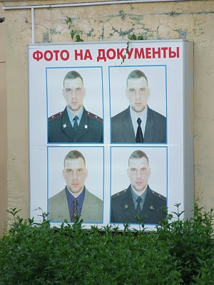
17. I also enjoyed the idea of this document photography service. Once you want to have a photograph on your passport, you can choose any outfit, even official uniform. Nice choice of a model as well.


16. Also, it is quite difficult to follow not only Russian signboards, but also traffic lights. Observing this taffic light for a while almost made me late for work.

17. I also enjoyed the idea of this document photography service. Once you want to have a photograph on your passport, you can choose any outfit, even official uniform. Nice choice of a model as well.

18. As there are so many homeless cats and dogs in the streets of Saint Petersburg, it is really hard for them to stay outside. Thus good people would often make an opening for animals in the cellar and put some food near, which is cute. But bad people would close it again. And then good people would sign something like "do not close", which looks very adorable to me.


19. Once walking on a street I found a baloon on the ground, it looked so poor and helpless, but I could not help it. The fate of ballons in general is so abstract, as we never know where will they end up.

20. In this picture fake "Peter the first" tries to avoid photographing. However, that is what he is for there. Usually, people in costumes take money for making photograph with them, but as soon as you are approaching them with the camera, they hide. They do not look friendly at all.
For a final word, I would like to say that life is wonderful and usually these are small and simple things which we observe and interpret make it like that. Even though sometimes things are being strange and we might not understrand them, it is important we approach them in a humorous, sometimes ironical way. Moreover, there is always a space for improvement, and Russian design for me, prooves that creative people still got a lot of opportunities to make business look more professional and stylish.


No comments:
Post a Comment